Overview
교통 표지판 분류는 자율 주행 자동차에 중요한 과제이다.
이 프로젝트에서는 LeNet이라는 딥 네트워크를 교통 표지판 이미지 분류에 사용한다.
데이터 세트에는 43개의 서로 다른 이미지 클래스가 포함되어 있다.
클래스는 아래와 같다.
( 0, b'Speed limit (20km/h)') ( 1, b'Speed limit (30km/h)') ( 2, b'Speed limit (50km/h)') ( 3, b'Speed limit (60km/h)') ( 4, b'Speed limit (70km/h)')( 5, b'Speed limit (80km/h)') ( 6, b'End of speed limit (80km/h)') ( 7, b'Speed limit (100km/h)') ( 8, b'Speed limit (120km/h)') ( 9, b'No passing')
(10, b'No passing for vehicles over 3.5 metric tons') (11, b'Right-of-way at the next intersection') (12, b'Priority road') (13, b'Yield') (14, b'Stop')
(15, b'No vehicles') (16, b'Vehicles over 3.5 metric tons prohibited') (17, b'No entry')
(18, b'General caution') (19, b'Dangerous curve to the left')
(20, b'Dangerous curve to the right') (21, b'Double curve')
(22, b'Bumpy road') (23, b'Slippery road')
(24, b'Road narrows on the right') (25, b'Road work')
(26, b'Traffic signals') (27, b'Pedestrians') (28, b'Children crossing')
(29, b'Bicycles crossing') (30, b'Beware of ice/snow')
(31, b'Wild animals crossing')
(32, b'End of all speed and passing limits') (33, b'Turn right ahead')
(34, b'Turn left ahead') (35, b'Ahead only') (36, b'Go straight or right')
(37, b'Go straight or left') (38, b'Keep right') (39, b'Keep left')
(40, b'Roundabout mandatory') (41, b'End of no passing')
(42, b'End of no passing by vehicles over 3.5 metric tons')
LeNet
사용된 네트워크는 Yann LeCun이 발표한 LeNet이다.
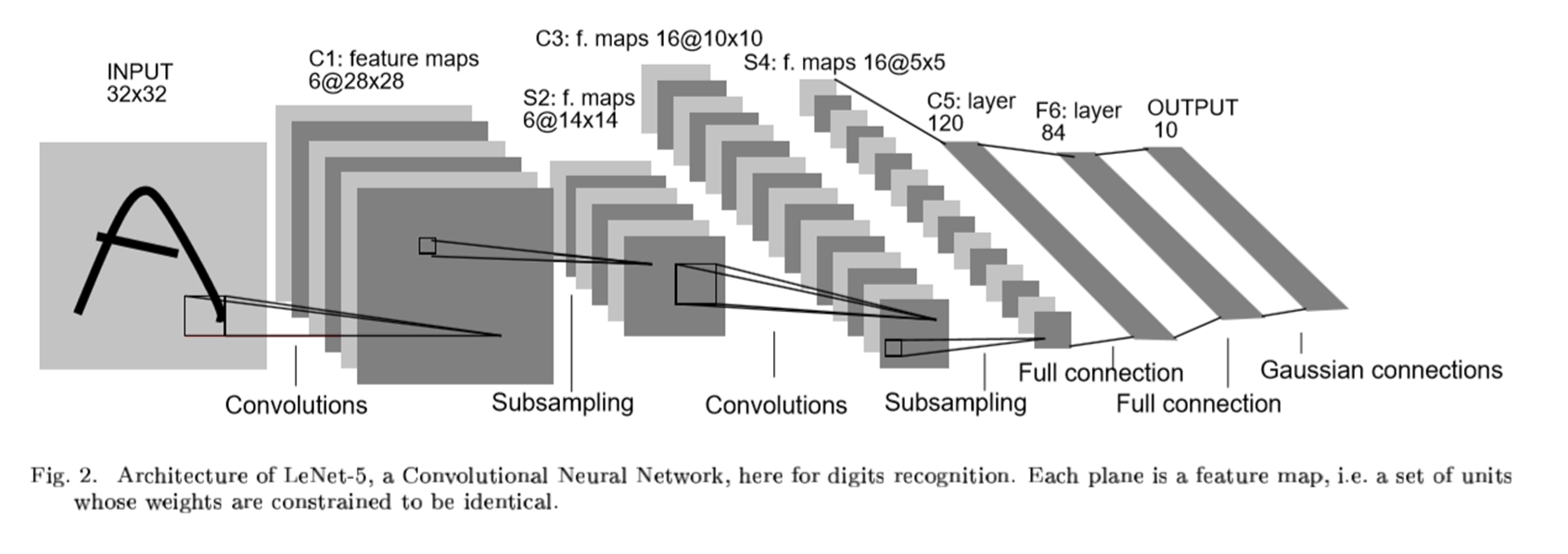
STEP 1: THE FIRST CONVOLUTIONAL LAYER #1
STEP 2: THE SECOND CONVOLUTIONAL LAYER #2
STEP 3: FLATTENING THE NETWORK
STEP 4: FULLY CONNECTED LAYER
STEP 5: ANOTHER FULLY CONNECTED LAYER
STEP 6: FULLY CONNECTED LAYER
Import Library and Dataset
import pandas as pd
import numpy as np
import matplotlib.pyplot as plt
import seaborn as sns
import pickle
이미지를 가져오기 위한 picke를 설치해줘야 한다.
with open("./traffic-signs-data/train.p", mode='rb') as training_data:
    train = pickle.load(training_data)
with open("./traffic-signs-data/valid.p", mode='rb') as validation_data:
    valid = pickle.load(validation_data)
with open("./traffic-signs-data/test.p", mode='rb') as testing_data:
    test = pickle.load(testing_data)
훈련, 검증, 테스트 세트를 각각 가져와준다.
X_train, y_train = train['features'], train['labels']
X_validation, y_validation = valid['features'], valid['labels']
X_test, y_test = test['features'], test['labels']
각 데이터를 입력값과 출력값을 분리해준다.
Image Exporation
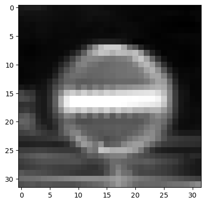
i = 5000
plt.imshow(X_train[i])
y_train[i]
이미지가 잘 매칭되어 있는지 확인해보기 위해서 imshow를 사용한다.
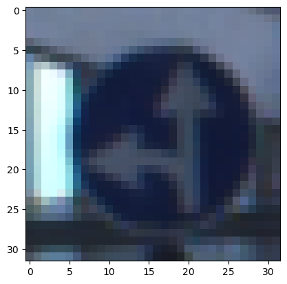
37번으로 나왔고, 위의 클래스 분류를 확인해보면 (37, b'Go straight or left') 라고 나와있다.
잘 매칭되어 있는 것 같다.
Data Preparation
from sklearn.utils import shuffle
X_train, y_train = shuffle(X_train, y_train)
훈련을 하기 위해서 셔플을 해주는 것이 모델 학습에 도움이 된다. 순서대로 학습을 하는 것보다 무작위로 데이터를 받아 학습하는 것이 더 좋을 것이다.
X_train_gray = np.sum(X_train/3, axis=3, keepdims=True)
X_validation_gray  = np.sum(X_validation/3, axis=3, keepdims=True)
X_test_gray  = np.sum(X_test/3, axis=3, keepdims=True)
현재 이미지 데이터는 컬러인데 grayscale로 변경하는 것이 모델 학습 속도와 학습 효과에도 좋을 것이다.
컬러는 3개의 채널을 가지고 있고 흑백은 1개의 채널을 사용하기 때문에 학습 속도가 향상되고,
흑백은 픽셀의 영향을 덜 받기 때문에 학습 효과에도 좋다.
X_train_gray_norm = (X_train_gray - 128)/128
X_test_gray_norm = (X_test_gray - 128)/128
X_validation_gray_norm = (X_validation_gray - 128)/128
normalization을 해줘서 학습 효과를 더 좋게 할 수 있다.
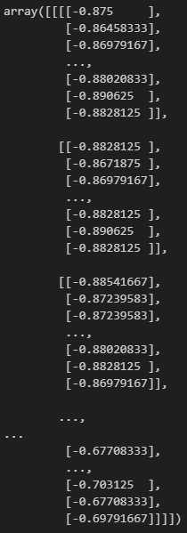
i = 5000
plt.imshow(X_train_gray[i].squeeze(), cmap='gray')
plt.figure()
plt.imshow(X_train[i])
plt.figure()
plt.imshow(X_train_gray_norm[i].squeeze(), cmap='gray')
흑백을 만든 데이터과 원본 데이터가 매칭이 잘 되어 있는지 확인해보자.

잘 되어 있는 것 같다.
Model Training
from keras.models import Sequential
from keras.layers import Conv2D, MaxPooling2D, AveragePooling2D, Dense, Flatten, Dropout
from keras.optimizers import Adam
from keras.callbacks import TensorBoard
모델을 설계하기 위해서 라이브러리를 import해주자.
cnn_model = Sequential()

cnn_model.add(Conv2D(filters=6, kernel_size=(5, 5), activation='relu', input_shape=(32, 32, 1)))
cnn_model.add(MaxPooling2D())

cnn_model.add(Conv2D(filters=16, kernel_size=(5, 5), activation='relu'))
cnn_model.add(MaxPooling2D())

cnn_model.add(Flatten())
cnn_model.add(Dense(units=120, activation='relu', ))
cnn_model.add(Dense(units=84, activation='relu'))
cnn_model.add(Dense(units=43, activation='softmax'))
이 모델 설계는 위의 구조에 맞도록 설계한 것이다.
cnn_model.compile(loss='sparse_categorical_crossentropy', optimizer=Adam(learning_rate=0.001), metrics=['accuracy'])옵티마이저는 adam을 사용하였다.
history = cnn_model.fit(X_train_gray_norm, y_train, batch_size=500, epochs=300, verbose=1, validation_data=(X_validation_gray_norm, y_validation))epochs와 batch size를 적절한 값으로 입력하여 학습을 시킨다.
train accuracy는 100%가 나오고, valid accuracy는 93%가 나온다.
Model Evaluation
score = cnn_model.evaluate(X_test_gray_norm, y_test)
print('Test Accuracy: {}'.format(score[1]))
학습한 모델을 평가해보면 91%가 나온다.
from sklearn.metrics import confusion_matrix
cm = confusion_matrix(y_true, predicted_classes)
plt.figure(figsize=(25, 25))
sns.heatmap(cm, annot=True)
실제 값과 예측 값을 confusion matrix로 평가해보자.
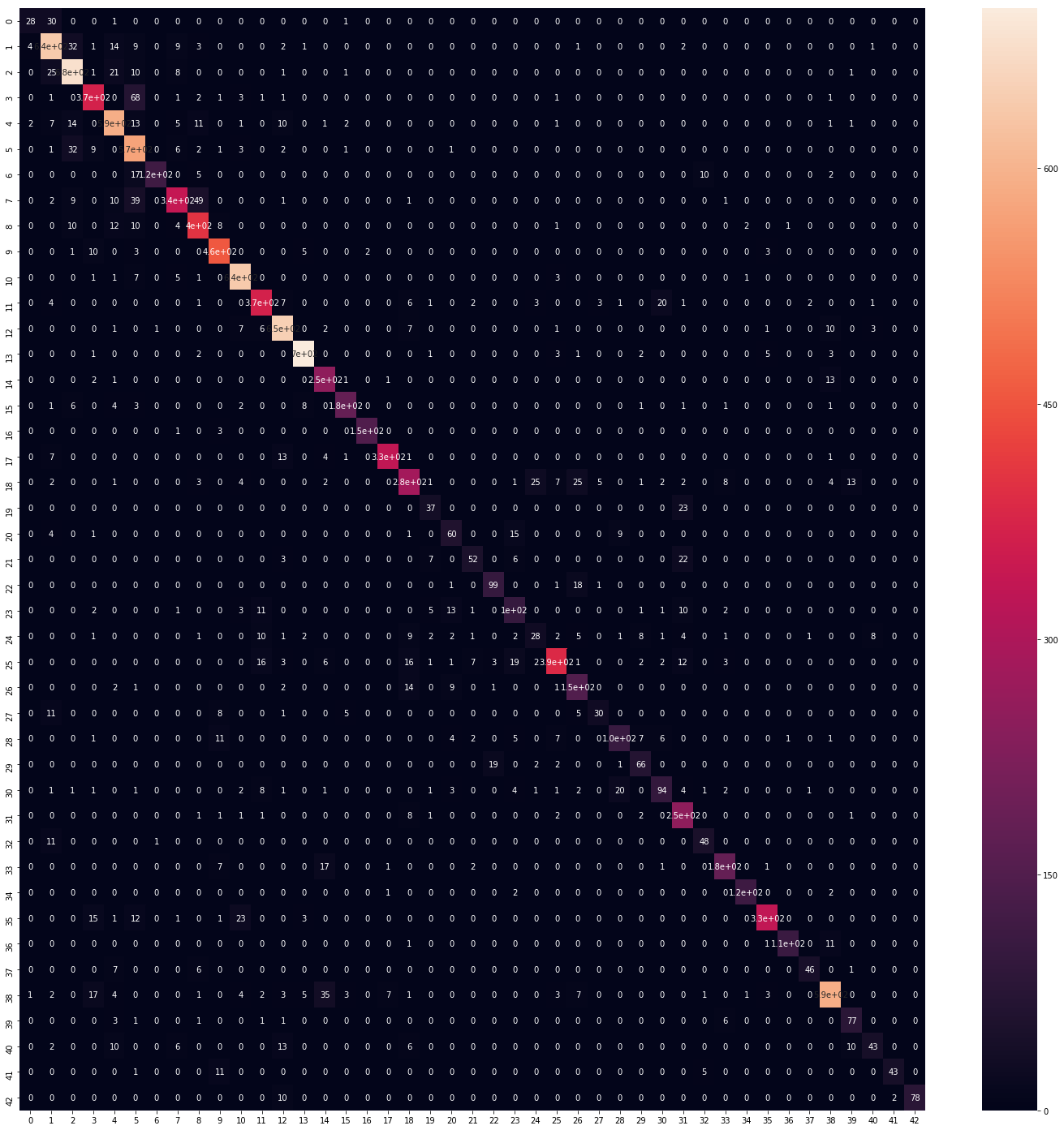
꽤 정확하게 예측이 된 것을 확인할 수 있다.
L = 7
W = 7

fig, axes = plt.subplots(L, W, figsize=(12, 12))
axes = axes.ravel()

for i in np.arange(L*W):
    axes[i].imshow(X_test[i])
    axes[i].set_title('Prediction = {}\n True = {}'.format(predicted_classes[i], y_true[i]))
    axes[i].axis('off')

plt.subplots_adjust(wspace=1)
실제 데이터와 모델이 예측한 값이 어떠한지 이미지를 확인해보고 비교해보자.
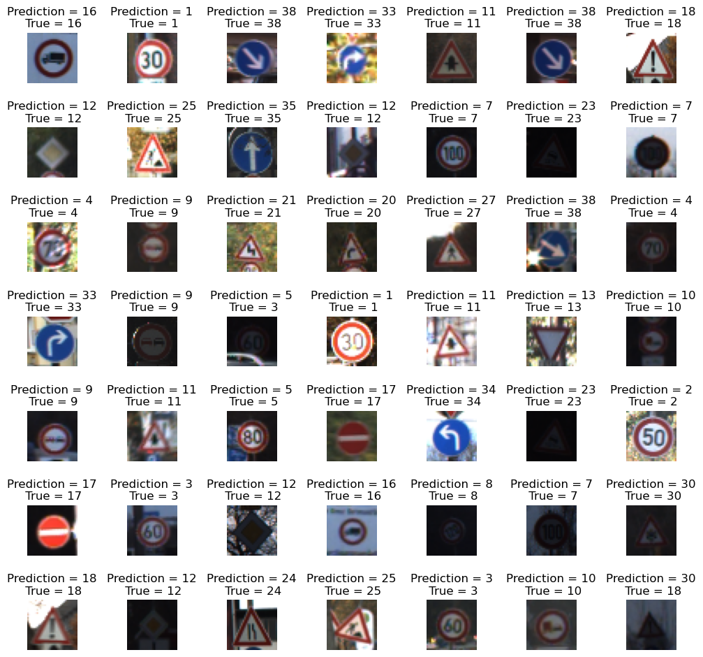
맨 마지막의 이미지는 18번 클래스인데 모델은 30번으로 예측했다.
이 이미지는 사람이 확인해도 해상도가 떨어져 확인하기 쉽지 않다..